Collaborators:
I was not a strong collaborator in school group projects. Sometimes surprisingly bossy and other times the lazy one, I always found them awkward.
Among the tasks of running V Smiley Preserves, working closely with artists, designers and farmers is my favorite.
There are all kinds of collaborations. For me, it encompasses everything from my eight-year working relationship with graphic-designer-turned-restaurant-owner Nova Askue to building specific flavors around the fruit that only Omar Fugaro grows in Addison County to my romantic and professional partnership with Amy.
Nova Askue
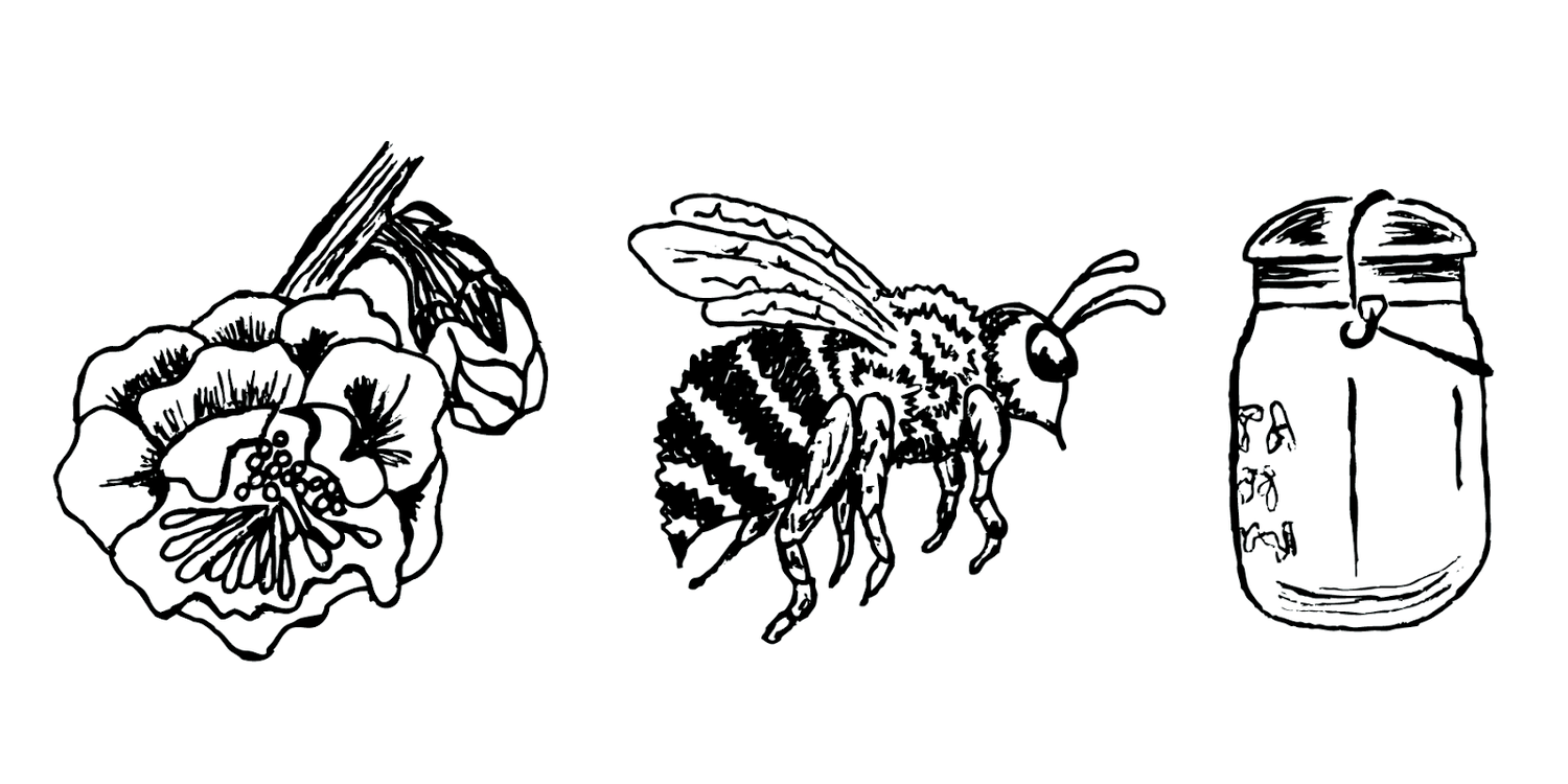
Today, Nova co-owns and runs the Lopez Island restaurant Ursa Minor with her husband and chef, Nick Coffey. I met Nova through Nick while he and I cooked at Sitka & Spruce in Seattle. Nova created the V Smiley Preserves (VSP) blossom, honeybee, and baled jar logo.
It’s a narrative image that reads left to right. For honey preserves, everything starts with the blossom. Pollinated by the honeybee, the blossom transforms in two directions, pollen into nectar, flower into fruit. The iconic image of a bale-closure canning jar calls back to the the Vermont farmhouse. The main room in our house held a wood cook stove, a dining table, a few rocking chairs and a wall of mason jars filled with canned tomatoes, peaches, applesauce and ketchup as well as spices, sugar and dry beans.
Folkway modernism is how I describe the VSP aesthetic. In college, studying art history I muddled through the courses on ancient art, perked up a little during the Rococo period but sat all the way forward in my seat for Modernism. Nova’s interest in letterpress printing (see Bazaar Collective poster), mid-century design and the natural world of plants means we share a common love for mixing old, new and naturalistic visuals.
Nova is the force behind the jar packaging for V Smiley Preserves. Packaging is storytelling and problem-solving combined in visual form. The configuration of shapes, colors and text are the best chance at getting picked up off the shelf and purchased.
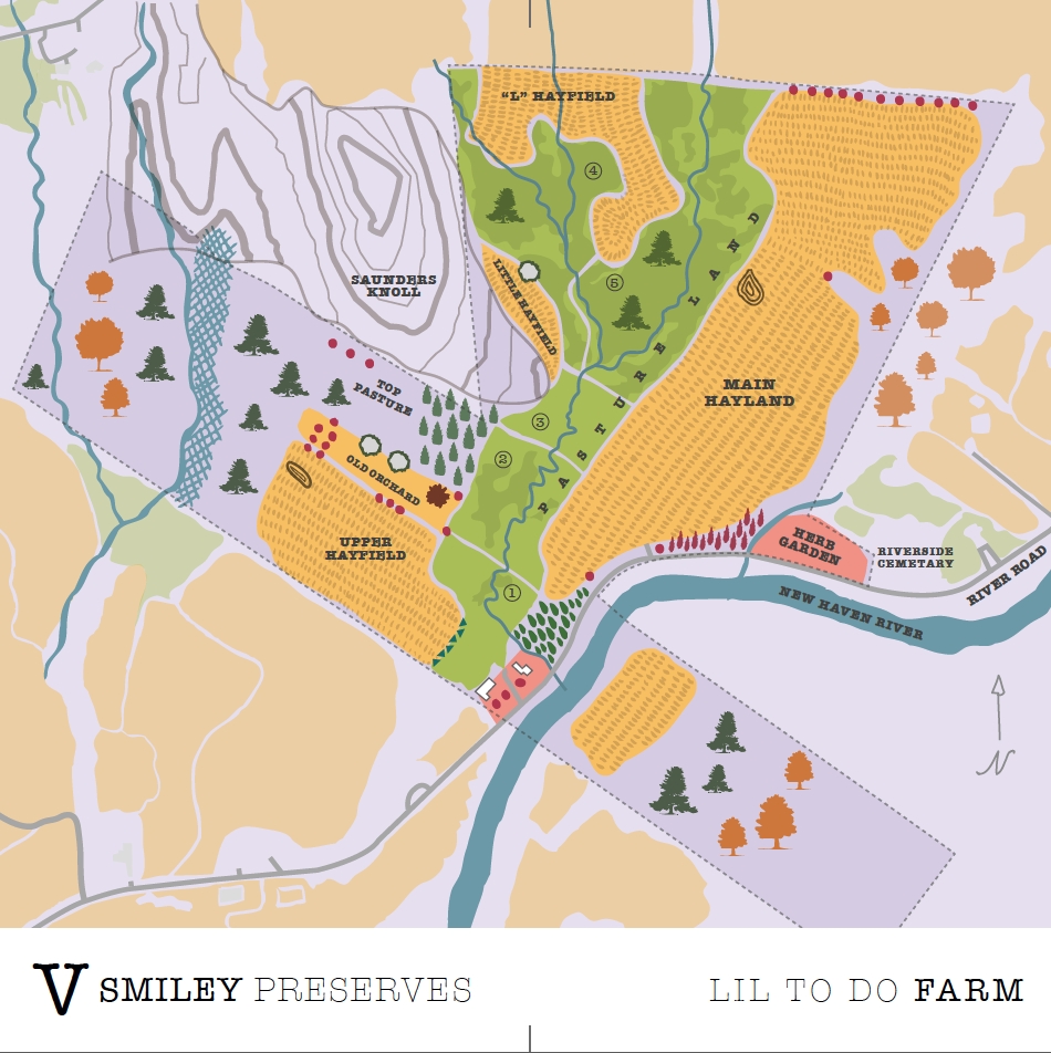
In addition to overseeing label design for V Smiley Preserves, Nova created a map of the farm where I grew up. This was our most ambitious project to date. Mad respect to map-makers! Maps are complicated documents to put together and then layer with visual style. Originally commissioned as the face of a fancy, gate-fold brochure (also designed by Nova) printed in 2016 for trade shows, the map and key evolved into a stand alone image and resource. During a recent drone image capturing project, we used the map to pinpoint where on the farm to photograph and how to find those places.
Hannah Viano
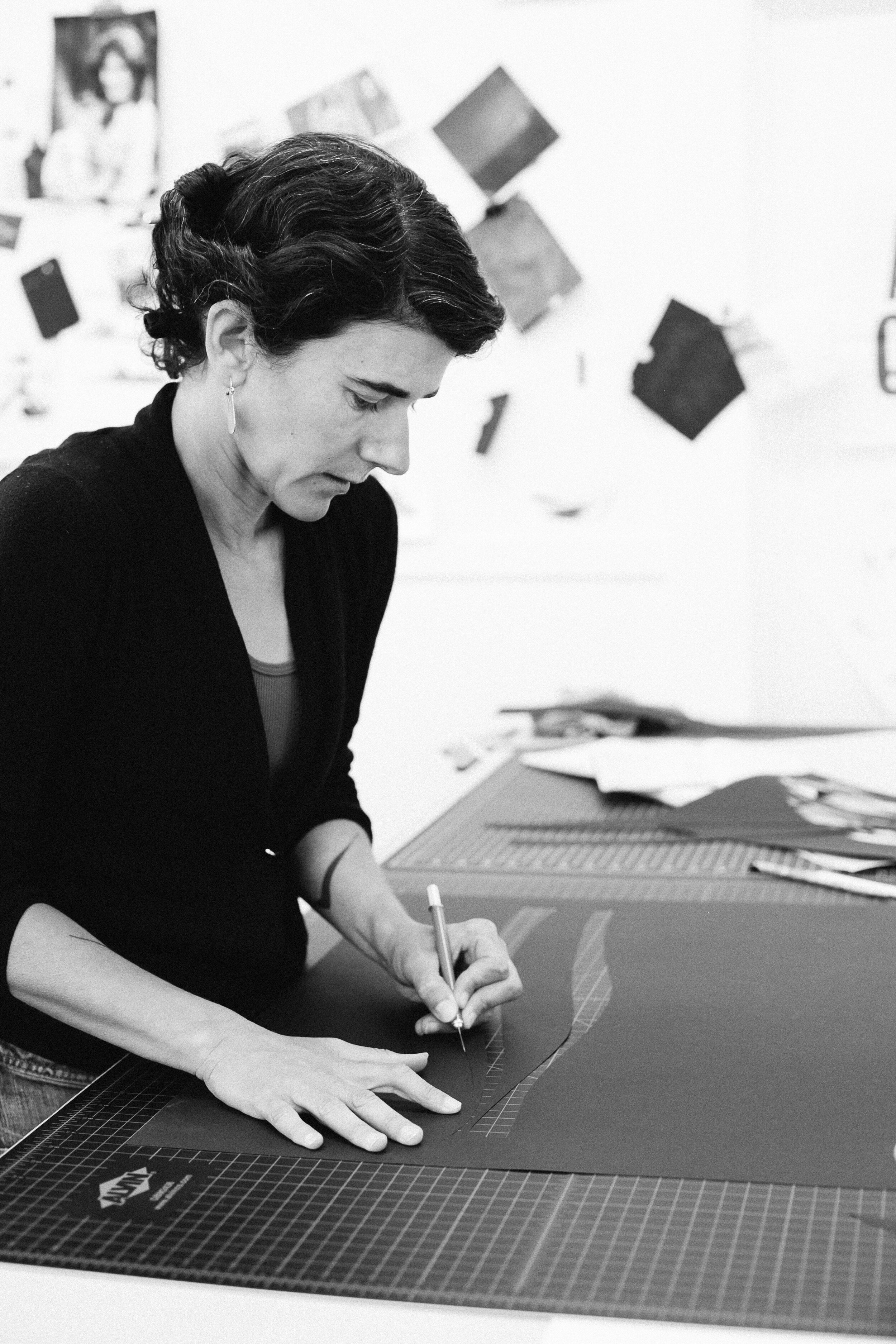
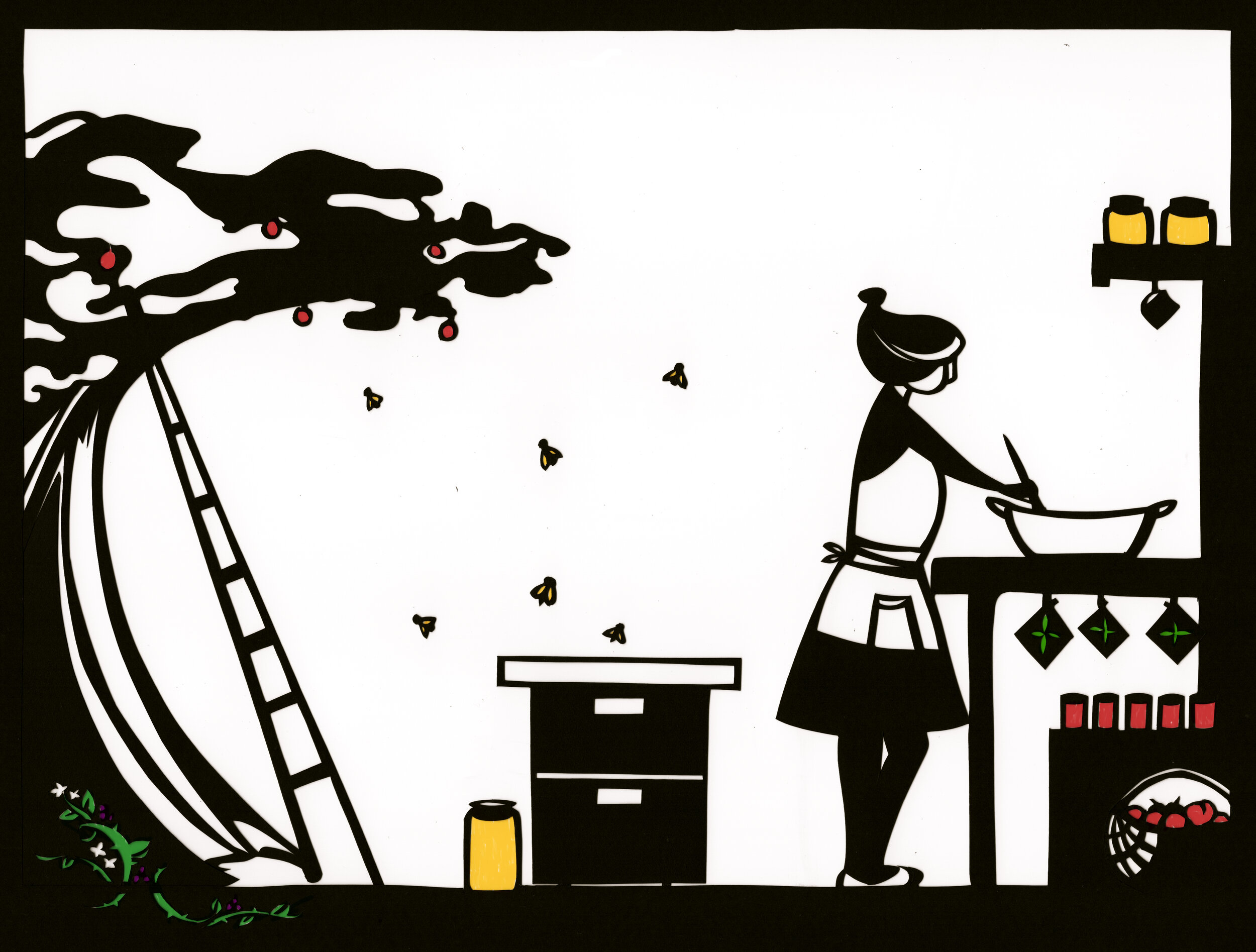
Working primarily in papercuts, Hannah captures the gestural landscape. I met Hannah through the world of wooden boats. Amy trained and worked in marine carpentry and the boatwrights, enthusiasts, their partners became her primary social community. As I got to know Amy, I met Hannah who also swirled socially and professionally in Seattle’s wooden boat culture. Hannah herself is a sailor and her work is full of water and boat imagery. With the minimal application of carefully cut paper, Hannah shows us the simultaneously friendly and ferocious ocean wave. There are children’s books, journals and a project about trees of the Pacific all drawn by Hannah and you should check out all her work. I sometimes wonder if the images that I ask Hannah to articulate for V Smiley Preserves (which generally capture a life close to home, inside, cooking, eating) are inert and boring compared to the adventures captured in her more personal work. As I said before, collaborations take all forms. You love someone's work, you want to see your world interpreted by their visual language or you want to get to know them better or they seem especially open to collaboration because they have a section on their website called Commissions. Hannah is all these things to me and V Smiley Preserves.
Hannah’s first papercut for V Smiley Preserves fleshes out the blossom to preserves narrative of Nova Askue’s original logo with the honeybee at the center of the story. Blackberry brambles curl around the fruit tree base while I feel along the bottom of a wide preserving pan. This image evolved into a secondary logo for V Smiley Preserves used on banners, stickers, tote bags, etc.
I bought my first car when I moved to Vermont at age 31. Up to that point, living in Los Angeles, on Whidbey Island and Seattle, I relied upon my bicycle and later Zipcars when I needed to get jam, pop up tent and weights to farmers markets. Shortly after I started V Smiley Preserves, Amy bought me a fancy bike trailer for hauling fruit to my SoDo Seattle kitchen. Pulling this contraption around was hard work on the legs, but I never lost fruit off the back side despite what this papercut says! Hannah and I wanted to capture all the gear grinding, stop signs and honked horns of getting around by bicycle and escapee fruit seemed like one way to say it.
Hannah’s third piece for V Smiley Preserves was commissioned for the Contact page on the website. I still lived in Seattle at the time and online sales were barely a thing for V Smiley Preserves, but I wanted that to change. Hannah and I wanted to conjure the coziness of the breakfast table and start connecting that jam jar sitting beside your toast to the VSP website where you could read where the fruit came from, re-order, or gift jams to your family spread across the country.
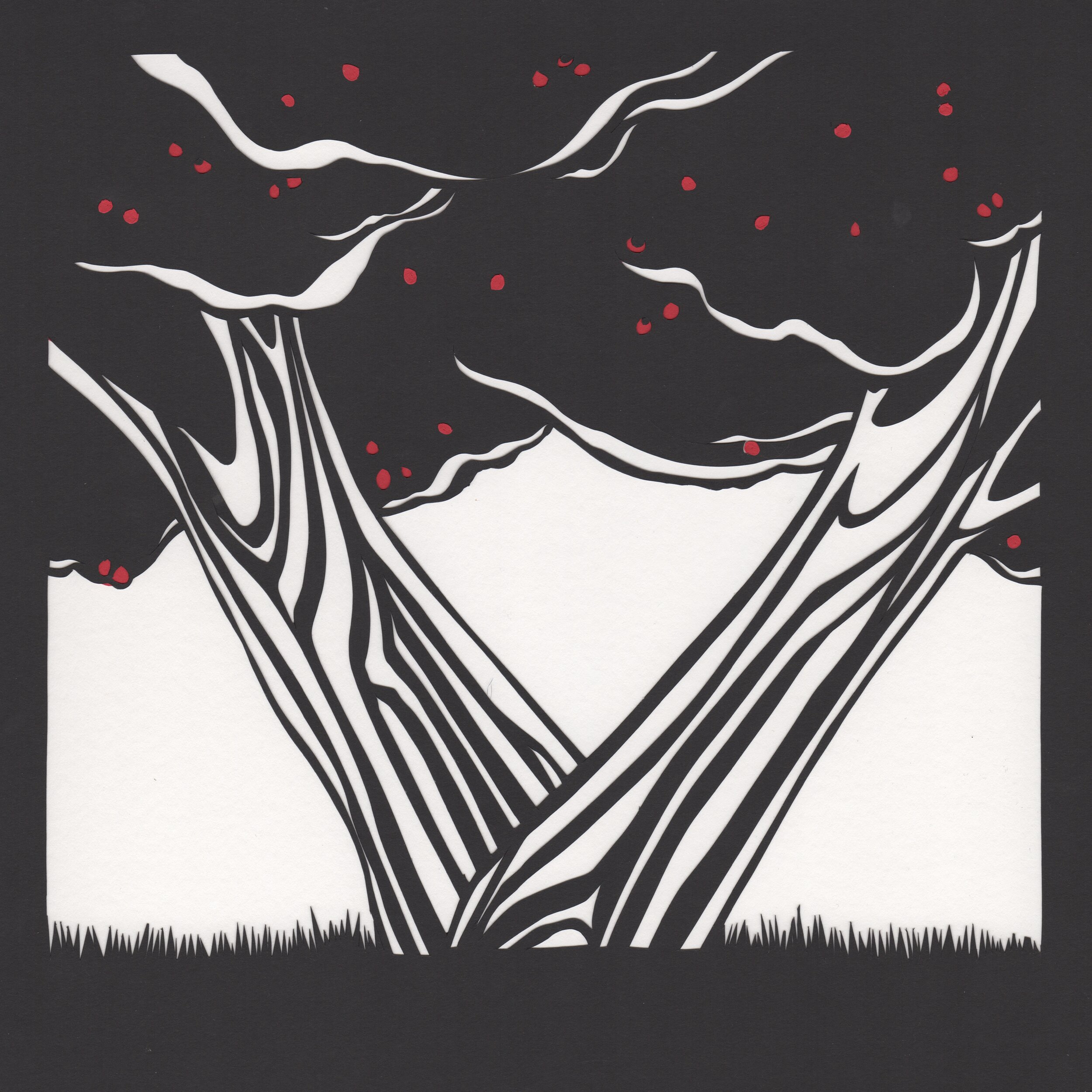
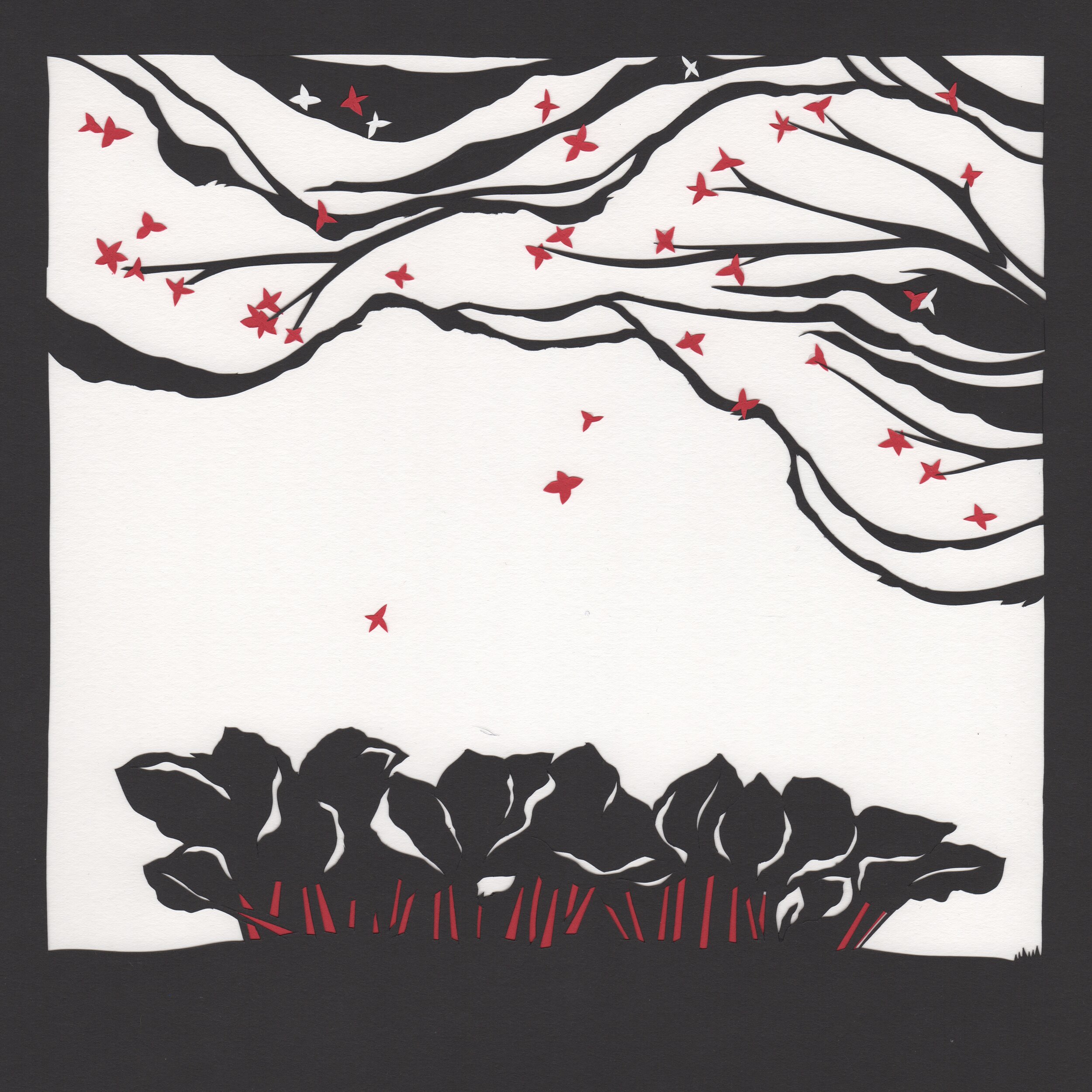

Three Seasons is how I describe the annual cycle of work at V Smiley Preserves. Each season differs in length and temperament. Spring is short, winter is long and involves stretching the fall harvest of quince, apples and pears as long as possible. Summer manages to feel both statuesque and ephemeral at the same time. It is the busiest and fullest time. For years, I’ve wanted to translate the work cycle of V Smiley Preserves into a gift box. A flavor from each season. I knew it would be a big financial undertaking. In 2018, V Smiley Preserves finally had the budget to start work on this project. The first step was new artwork from Hannah.
From the outset of the project I envisioned a square gift box. Each season could fill a side on the box. I wondered if the triptych, a three paneled image, might work well here.
By now, I lived in Vermont and Hannah had moved from Seattle to Twisp, WA and would soon depart for Norway. In Seattle, Hannah and I met in coffee shop. This was our first project done via phone and email.
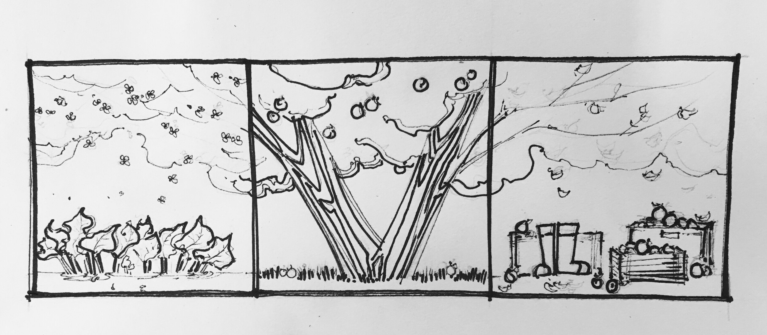
In preparation for a phone call to talk through inspiration and ideas for the the artwork, I scribbled down a brainstorm (see above). After sending Hannah my scattered writings and talking for an hour on the phone, Hannah came up with the idea of using a single fruit tree in its spring, summer and fall form. You can see the first sketch above. It was perfect. Spring rhubarb stalks busily pushed up and the rain boots signaled mucky harvest days. I loved it.
With the artwork complete, it was time to start work with a couple designers. First, a packaging designer and finally graphic designer Bethany Andrews Nichols. It all came together in a finished product for Holiday 2019 sales.
Bethany Andrews Nichols - Beenanza Design
Bethany has worked as a graphic designer for over a decade. These days, art is her primary professional focus. Her work centers on pattern-making and block printing. I keep asking for help with graphic design projects like the recent 3 Seasons Gift Box Project (below) which she spearheaded design wise, but I’ve wanted to do other fun work together that is both jam focused and pattern filled.
I learned about Bethany through Instagram and her work with Vermont Womenpreneurs. It was summer and I was preparing for my first big trade show, NY Now at the Javits Center in NYC. I needed a fancy booth, had a limited budget and a lot of nerves about the show. Enter Bethany. She was calm, super experienced (and thus full of amazing ideas), warm and professional. But the best part? The emails. Writing back and forth, communicating edits and revisions is not easy. I love a long email writer, someone who works in paragraphs and bullet points.
I love the regenerative world-scape inside each pattern. Pattern is visual rhythm built with a toolbox of familiar shapes ready for endless improvisation. It’s accessible and endlessly ready to change.
“V Smiley Preserves in a Beenanza world” (above) was finished in 2020. Jam should be so good you want to eat it straight from the jar. That’s what I tell myself. It’s the goal. Sometimes a customer will tell me (sheepishly) that they spoon directly from the jar for snacks. It’s the ultimate compliment. No need for embarrassment.
Here we have someone, a human, eating jam for dinner. Bethany already had a hybrid pattern/portrait series she did with Beenanza Design of a lady. While this jam eater isn’t necessarily me (I don’t have any tattoos), I wanted them to be gender-fluid/free.
Omar Fugaro
Omar Fugaro is a one person operation called Omar’s Uncommon Fruits. Using rows of all lengths, Omar slowly and steadily surrounded his childhood home with several thousand edible plants and shrubs. The gardens are situated on the same ridgeline that our Lil To Do Farm sits at the base of. Omar’s land is flat. It’s almost always windy up there. The soil, like much of Addison County, is mostly clay though by now it’s heavily amended and changed by years of experimentation like the small drainage ditches placed between rows of raspberries, which are plants that especially dislike wet feet.
Omar grows black, red, yellow and orange raspberries, gooseberries and currants of all shades, plus rhubarb and strawberries spring through fall. Less than a 15-minute drive away, closer to the climate offered by Lake Champlain, Omar tends a tree fruit orchard filled with Japanese and European plums, peaches and Asian pears.
I learned about Omar while cooking at a restaurant that bought a lot of fruit from him. First I saw the berries coming into the walkin cooler. Beautiful, beautiful gooseberries of all colors and sizes, currants colored ivory, black and red, and more black raspberries then I thought possible. I was newly moved back to Vermont and wondering where I was going to source fruit. I figured out where these gorgeous berries were coming from and made a trip to the Middlebury Farmers Market to introduce myself to Omar.
There are multiple V Smiley Preserves flavors that came about because of what Omar grows. I fell in love with the Black Velvet and Tixia varieties of gooseberries and built Tixia Gooseberry Candy Citrus Jam and Black Velvet Gooseberry Summer Flowers Jam around these flavors. Sometimes crop failure happens and when it does it means a flavor must take a year off.
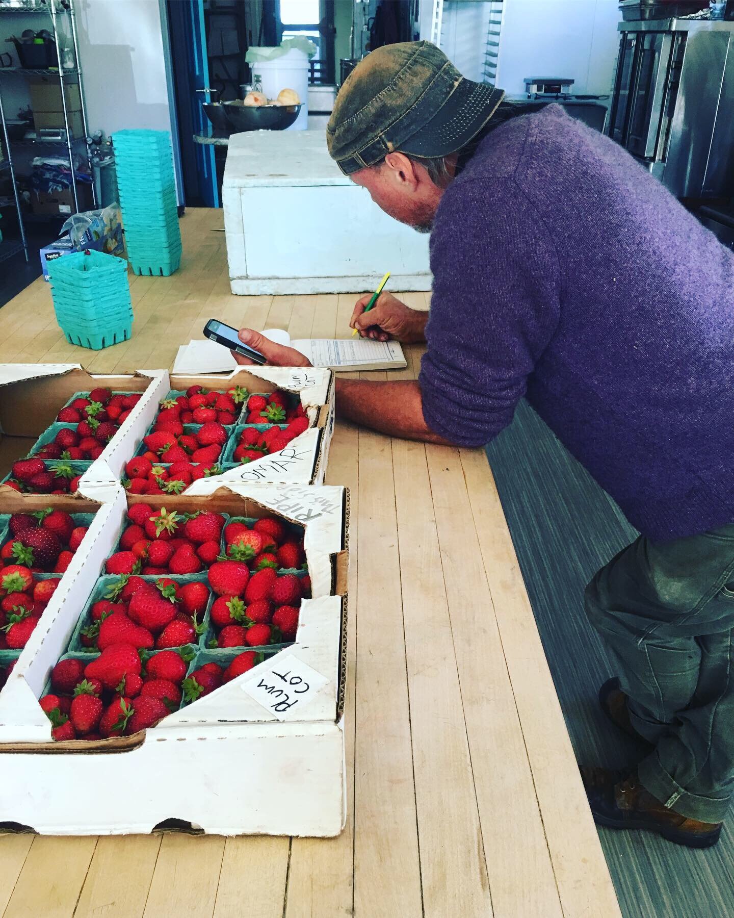
Occasionally I drive to the farm and pick up fruit. As the season wears on, Omar starts delivering almost weekly to the jam kitchen. Omar always writes the invoice on premises and these are often long exchanges with a delivery lasting 20-40 minutes. Omar loves to talk about fruit and I’ve learned so much from our conversations over the years.


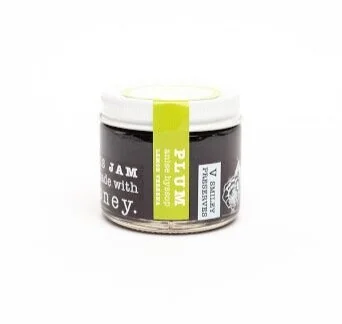
Cornwalls Plums & Honey and Plum Anise Hyssop Lemon Verbena Jam came about as flavors in 2015 because of a the wide variety of plums grown by Omar in Cornwall Vermont. Ever year he sells V Smiley Preserves a different mix of Japanese, hybrid and European plums. Frost dates in the spring impact the mix of plums ultimately available for harvest. A mixed plum jam like Cornwall Plums makes room for this variability. Sometimes tree fruit doesn’t get culled or dropped after fruit-set and the tree’s energy is spread too thin. The tree grows heavy and full with small, slightly bland, but perfectly useful fruit. Or sometimes, just as the La Cresent plums are ripe, it rains and they burst their skins. I built flavors to accommodate these moments in the harvest. Plum Anise Hyssop Lemon Verbena Jam, which is made using jelly methods produces an intense plummy jam and gives home to less than perfect plums.
Omar is uniquely focused on delivering a quality product. The fruit he brings in is perfect. “You need to pick black raspberries with the sun over your shoulder or you will pick unripe fruit,” he’ll tell you on the subject of black raspberries. His black raspberries fill Black Raspberry Sour Cherry Plum Conserve. And Omar is V Smiley Preserves primary supplier of raspberries and strawberries.
Lauren Mazzotta
Late in 2019, I decided to re-do this website. I'd received advice; VSP needed more/new pictures and a refreshed site or I would struggle to expand the audience and grow the company.
This was daunting (find a visual work partner!?) and exciting (make art with someone!!) and could have gone a couple ways. Sometimes the internet is perfect. Bethany from Beenanza reccomended Lauren, but I was nervous to work with someone 50 minutes away knowing how much exchange of goods and planning this project required. (I rarely leave Addison County and getting up to Burlington is no small feat for me).
I fell in love with Lauren's Instagram photographs. Under the photo-copier image, Lauren wrote, "Monday feels - So grateful for creative clients 🖤" from which I read an invitation (she welcomed the bizarre and offbeat), a little challenge/assertion (some client work is more fun than others, could I be a fun one?), and a couple questions for me too, mostly centering on "how do images get built”?
Over the last year, Lauren Mazzotta has become the visual rock for V Smiley Preserves.
Her landscapes ooze light and have a sculptural quality. The compositions reminded me of California, places I'd lived, places I biked through in Seattle. Her close up portraits of folks made me wonder, what was she saying during these shoots? People look so comfortable! I found out later, she makes bad jokes to mellow the room.
Lauren studied photography for undergrad and went straight into the field upon graduation. On top of her strong and consistent visual point of view, she is a masterful re-toucher (honed, I believe, during her time shooting and editing the catalog for Orvis), which I've found particularly helpful in our styled jar images. Her re-touching and corrections are such a gift for our long shoot days when sometimes we need to just keep moving.
